 PluginStats
@kuniversedev/design-tokens weekly downloads statistics
By kuniversedev · npm · Tailwind plugins
K-Universe design tokens — CSS variables, TypeScript token objects, Tailwind plugin, and branding primitives
@kuniversedev/design-tokens has 8 recorded weekly downloads on npm.
About @kuniversedev/design-tokens
@k-universe/design-tokens
K-Universe design tokens — CSS custom properties, TypeScript token objects, Tailwind CSS plugin, and React branding primitives. Install once, apply the K-Universe design system anywhere.


Install
# pnpm (recommended)
pnpm add @k-universe/design-tokens

# npm
npm install @k-universe/design-tokens

# bun
bun add @k-universe/design-tokens
Token overview
| Category | Description |
|---|---|
| Colors | Monochrome foundation + --ku-primary (#0066FF) + --ku-secondary (#00CC88) |
| Typography | Power Grotesk scale (hero → tiny), JetBrains Mono for code |
| Spacing | 8px base grid (4px → 128px), 60px margin principle |
| Motion | GSAP-aligned durations + cubic-bezier easings |
| Layout | 60px margins, 1320px max-width, section spacing |
| Radius | xs (2px) → round (9999px) |
| Shadows | Elevation 1–4 + glow variants |
Usage
Option 1 — Drop-in CSS (no build step)
Import the standalone CSS file and use --ku-* variables in your stylesheets.
<!-- HTML -->
<link rel="stylesheet" href="node_modules/@k-universe/design-tokens/standalone/css">
/* CSS/PostCSS */
@import "@k-universe/design-tokens/standalone/css";
// Vite / bundler
import "@k-universe/design-tokens/standalone/css";
Then use variables anywhere:
.card {
  background: var(--ku-surface);
  border: 1px solid var(--ku-border);
  color: var(--ku-text);
  font-family: var(--ku-font-primary);
  border-radius: var(--ku-radius-lg);
}

.button-primary {
  background: var(--ku-primary);
  color: var(--ku-white);
  transition: background var(--ku-duration-fast) var(--ku-ease-default);
}

.button-primary:hover {
  background: var(--ku-primary-hover);
}
Option 2 — TypeScript token objects
import { tokens } from "@k-universe/design-tokens"

// Colors
tokens.colors.primary        // '#0066FF'
tokens.colors.secondary      // '#00CC88'
tokens.colors.background     // '#0A0A0A'
tokens.colors.surface        // '#1A1A1A'
tokens.colors.foreground     // '#FFFFFF'

// Typography
tokens.typography.fontFamily.sans   // 'Power Grotesk, ...'
tokens.typography.fontFamily.mono   // 'JetBrains Mono, ...'
tokens.typography.scale.h1.size     // '3rem'

// Spacing
tokens.spacing[4]    // '16px'
tokens.spacing[15]   // '60px'  ← K-Universe 60px margin

// Motion
tokens.motion.duration.default   // '300ms'
tokens.motion.easing.default     // 'cubic-bezier(0.4, 0, 0.2, 1)'
Option 3 — CSS variable injection (JavaScript)
import { applyCSSVarsToDocument } from "@k-universe/design-tokens/css"

// Inject all --ku-* vars onto :root
applyCSSVarsToDocument()

// Or generate the object only
import { generateCSSVars } from "@k-universe/design-tokens/css"
const vars = generateCSSVars()
// { '--ku-primary': '#0066FF', '--ku-bg': '#0A0A0A', ... }
Option 4 — Tailwind CSS plugin
// tailwind.config.ts
import kuPlugin from "@k-universe/design-tokens/tailwind"

export default {
  content: ["./src/**/*.{ts,tsx,html}"],
  plugins: [kuPlugin],
}
This maps all tokens into Tailwind utilities:
<div class="bg-ku-surface text-ku-primary font-ku-sans">
  <p class="text-ku-body leading-ku-body tracking-ku-normal">
    K-Universe styled text
  </p>
</div>
Option 5 — React branding component
import { KLogoIcon, KLogo } from "@k-universe/design-tokens/branding"

// Icon only (SVG)
<KLogoIcon size={32} color="var(--ku-primary)" />

// Full wordmark
<KLogo height={24} />
Note on fonts: Power Grotesk is a commercially licensed typeface. The CSS variable
--ku-font-primaryreferences it by name with system-ui fallbacks. You need to supply the font files yourself (self-hosted or via a licensed CDN). The package ships variable definitions only — not the font binaries.
CSS variable reference
/* Surfaces */
--ku-bg              /* #0A0A0A — page background */
--ku-surface         /* #111111 — card/panel surface */
--ku-surface-raised  /* #1A1A1A — raised elements */
--ku-surface-muted   /* #2A2A2A — muted/disabled */

/* Borders */
--ku-border          /* rgba(255,255,255,0.08) */
--ku-border-strong   /* rgba(255,255,255,0.14) */

/* Text */
--ku-text            /* #FFFFFF */
--ku-text-secondary  /* rgba(255,255,255,0.6) */
--ku-text-muted      /* rgba(255,255,255,0.35) */

/* Brand */
--ku-primary         /* #0066FF */
--ku-primary-hover   /* #0052CC */
--ku-primary-subtle  /* rgba(0,102,255,0.08) */
--ku-secondary       /* #00CC88 */
--ku-success         /* #00DD77 */
--ku-warning         /* #FFAA00 */
--ku-error           /* #FF3333 */

/* Typography */
--ku-font-primary    /* Power Grotesk, system-ui, sans-serif */
--ku-font-mono       /* JetBrains Mono, Fira Code, monospace */

/* Spacing (60px margin principle) */
--ku-spacing-15      /* 60px — primary horizontal landmark */

/* Motion */
--ku-duration-fast    /* 200ms */
--ku-duration-default /* 300ms */
--ku-ease-default     /* cubic-bezier(0.4, 0, 0.2, 1) */
Package exports
| Import path | Contents |
|---|---|
@k-universe/design-tokens | TypeScript tokens object + all types |
@k-universe/design-tokens/css | generateCSSVars, applyCSSVarsToDocument |
@k-universe/design-tokens/tailwind | Tailwind CSS v3/v4 plugin |
@k-universe/design-tokens/branding | KLogoIcon, KLogo React components |
@k-universe/design-tokens/standalone/css | Standalone CSS file (no build step) |
License
MIT © K-Universe
Description from the npm listing.
- design-tokens
- design-system
- k-universe
- css-variables
- css-custom-properties
- tailwind
- tailwindcss-plugin
- dark-mode
- branding
README badge
Show your rank in a README or on your website. The badge updates automatically.
Charts
Images: 30d · 1y · all time · 1600×900 dark
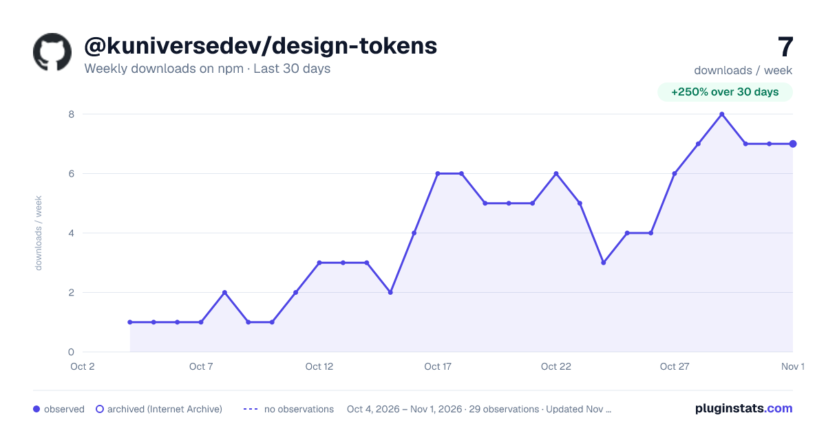
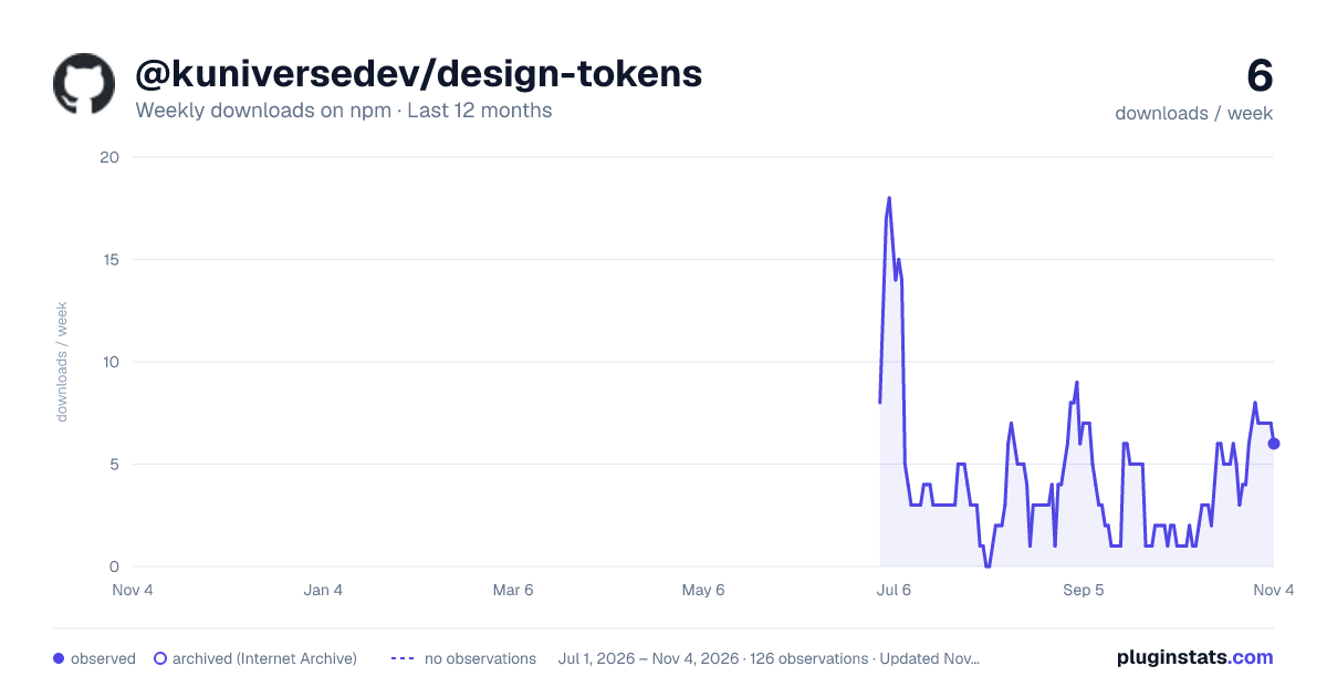
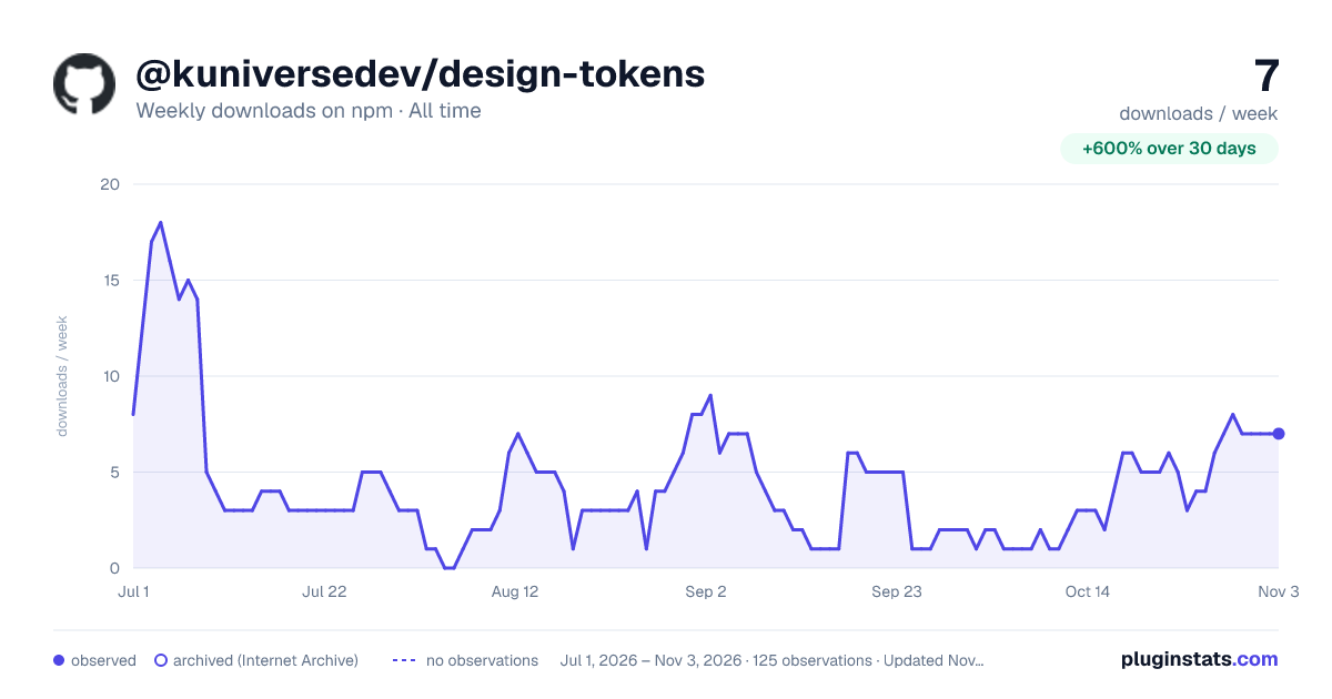

Adoption over time
7/30/90-day growth
Ranking history
Listing placement
Listing placement
Filled points are observed values; hollow points come from Internet Archive snapshots of the listing page. Dashed segments span periods with no observations — values between points are not interpolated.
Each band is one page of 20. Weekly downloads on a linear scale. Placement is projected from weekly downloads, so it can differ from the marketplace's own sort order. Hover a dot to see the listing.
Recent observations
Full history (1)Similar npm Tailwind plugins plugins
All 20 @kuniversedev/design-tokens alternatives- 8 weekly downloads-78.9%
- 8 weekly downloads-20.0%
- 8 weekly downloads+33.3%
Data source
Weekly downloads (trailing 7 complete days) come from the official npm downloads API. Downloads include CI and mirrors and are not equivalent to installs or users. npm publishes no ratings.
Listing: https://www.npmjs.com/package/@kuniversedev/design-tokens. First seen Oct 27, 2026; last successful collection Oct 27, 2026. See the methodology.