 PluginStats
@oprt/tailwind weekly downloads statistics
By oprt · npm · Tailwind plugins
OPERATOR design system plugin for Tailwind CSS 4: token-backed colors, spacing, control sizes, type, motion and container-query utilities. Install it with @oprt/tokens, which defines the custom properties it emits.
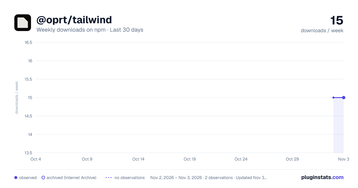
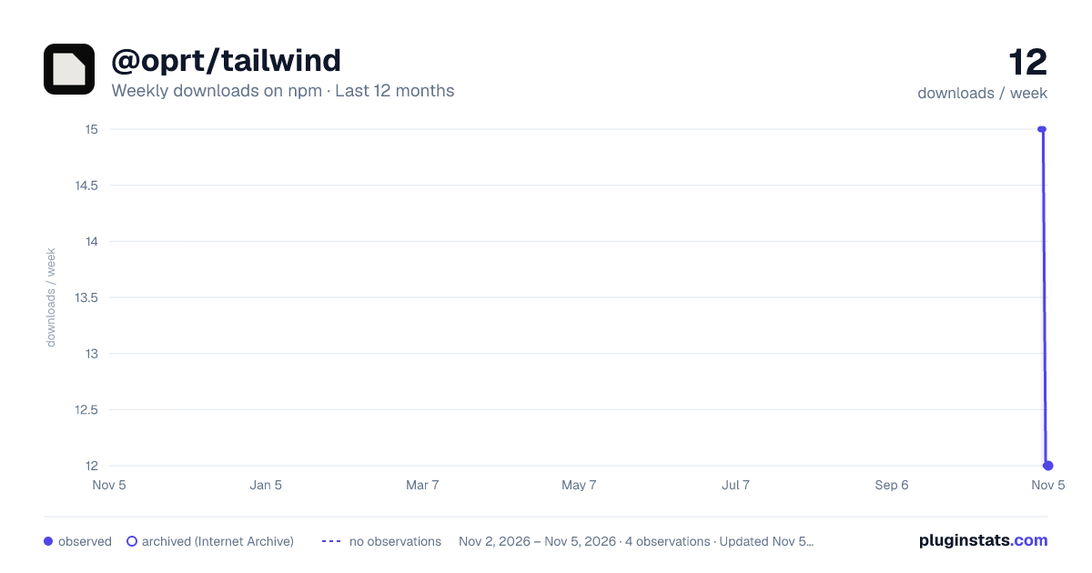
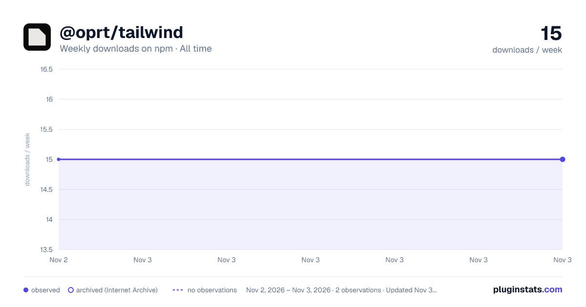
@oprt/tailwind has 15 recorded weekly downloads on npm, ranking #2179 of 2,855 tracked listings.
About @oprt/tailwind
@oprt/tailwind
The OPERATOR plugin for Tailwind CSS 4. It turns the custom properties from
@oprt/tokens into utilities, so a token change reaches every composed
component. Colors, spacing, control sizes, type, tracking, motion, focus, the container
variants and the wrap utility are all resolved through var(--oprt-*).
It needs Tailwind CSS 4.3.3 or a later 4.x release (tailwindcss >=4.3.3 <5), the versions it is
tested with. Tailwind CSS 3 is not supported.
Setup
Install both. The plugin emits only var(--oprt-*) references, and @oprt/tokens is what
defines them, so without it every OPERATOR declaration is invalid.
pnpm add @oprt/tokens
pnpm add -D @oprt/tailwind tailwindcss@^4.3.3
@oprt/tokens is not a peer dependency of this package, so your package manager will not
warn when it is missing or out of step. The @oprt packages are released together at one
version, and a peer range on a sibling would force a major bump of all of them. Keep the two on the
same release.
Add the plugin to the stylesheet where Tailwind is imported, and point Tailwind at the components:
@import "tailwindcss";
@plugin "@oprt/tailwind";
/* The components ship as compiled JavaScript, and Tailwind does not look inside node_modules on
   its own. Point it at them (the path is relative to this stylesheet), or they render unstyled. */
@source "../node_modules/@oprt/react/dist";
Import the tokens once at the application root, before that stylesheet (import "@oprt/tokens";),
or with a <link>. Not with an @import in the Tailwind stylesheet: the Tailwind CLI inlines an
imported file without rewriting its font URLs, so the bundled fonts would not load.
A JavaScript config loaded with @config works too (plugins: [operator]). From CommonJS,
require("@oprt/tailwind") returns the plugin itself, and .default remains as an alias.
The plugin also sets two defaults that Tailwind 4 dropped and the components rely on: a border
with no color class of its own takes --oprt-border, not the text color, and a button that can be
pressed shows the pointer cursor.
Utilities
Every scale is a theme key, so each works with the Tailwind prefixes that read it. For example, a
color key works in bg-, text-, border-, ring-, fill- and stroke- classes.
Colors: bg-oprt-<key>, text-oprt-<key>, border-oprt-<key> ...
| Role | Keys |
|---|---|
| Surfaces | bg, surface-1, surface-2, surface-3, surface-4, surface-5, surface-6 |
| Borders | border-subtle, border, border-strong, border-control, border-focus |
| Text | text, text-dim, text-placeholder, text-muted |
| Accent | accent, accent-light, accent-hover, accent-active, accent-ghost, accent-bg, accent-border |
| Success | success, success-subtle, success-strong |
| Warning | warning, warning-subtle, warning-strong |
| Error | error, error-subtle, error-strong |
| Info | info, info-subtle, info-strong |
| Series | cat-1, cat-2, cat-3, cat-4, cat-5, cat-6, cat-7, cat-8 |
| Sequence | data-seq-1, data-seq-2, data-seq-3, data-seq-4, data-seq-5 |
| Chart | chart-grid, chart-axis, chart-threshold |
| States | surface-hover, surface-active, surface-selected, overlay-scrim |
border-oprt-border and its siblings draw layout lines: tables, tabs, cards, dividers, panels.
The boundary of anything you click or type into (text fields, selects, checkboxes, radios,
toggles, segmented and disabled buttons) is border-oprt-border-control, which keeps 3:1 against
the surface it sits on.
Opacity modifiers work (bg-oprt-bg/80, border-oprt-error/40, bg-oprt-info/[.35]). Tailwind
mixes the token toward transparent with color-mix(), so it keeps its hue and only its alpha
falls. A bare border takes --oprt-border, not the text color.
Spacing: p-2u, gap-1u, -mt-0.5u ...
1u is 8px. Keys: 0.5u, 1u, 1.5u, 2u, 2.5u, 3u, 4u, 5u, 6u, 8u, 12u, 16u
and 40u. The table-cell insets are oprt-cell-inline, oprt-cell-block and
oprt-cell-block-dense. There is no 7u.
Control sizes: h-, w-, min-h-, min-w-, max-h-, max-w- + oprt-<key>
Keys: oprt-sm, oprt-md and oprt-lg (24, 32 and 40px controls); oprt-badge-sm and
oprt-badge-md; oprt-row and oprt-row-dense (table rows); oprt-track-sm, oprt-track-md
and oprt-track-lg (slider rails). Use min-h-oprt-sm for a target floor on content that may
grow.
Type: text-<key> and tracking-<key>…
Description from the npm listing.
- design-system
- tailwindcss
- tailwindcss-plugin
- design-tokens
README badge
Show your rank in a README or on your website. The badge updates automatically.
Charts
Images: 30d · 1y · all time · 1600×900 dark

Adoption over time
7/30/90-day growth
Ranking history
Listing placement
Listing placement
Filled points are observed values; hollow points come from Internet Archive snapshots of the listing page. Dashed segments span periods with no observations — values between points are not interpolated.
Each band is one page of 20. Weekly downloads on a linear scale. Placement is projected from weekly downloads, so it can differ from the marketplace's own sort order. Hover a dot to see the listing.
Recent observations
Full history (2)Similar npm Tailwind plugins plugins
All 20 @oprt/tailwind alternatives- 16 weekly downloads+33.3%
Data source
Weekly downloads (trailing 7 complete days) come from the official npm downloads API. Downloads include CI and mirrors and are not equivalent to installs or users. npm publishes no ratings.
Listing: https://www.npmjs.com/package/@oprt/tailwind. First seen Nov 4, 2026; last successful collection Nov 5, 2026. See the methodology.