 PluginStats
react-isokit weekly downloads statistics
By aadilghani1 · npm · Claude Code
Interactive isometric line figures for React: rounded boxes, faces you can draw on, keys you can press, and optional synthesized sound. Plus a Claude Code skill that draws them.
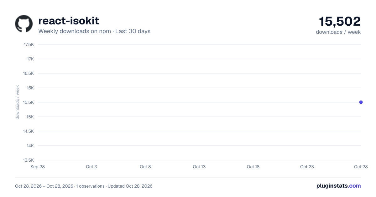
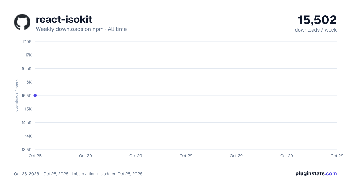
react-isokit has 15,502 recorded weekly downloads on npm, ranking #1059 of 2,687 tracked listings.
About react-isokit
isokit
Isometric figures you can press.
Rounded boxes, faces you can draw on, keys that click back, and sound you can hear.<br /> A small, typed React kit, and a skill your coding agent uses to draw with it.






Live demo · Quick start · API · With your agent
<a href="https://aadilghani1.github.io/isokit/"><img src="docs/demo.gif" width="880" alt="A desk computer typing a prompt, an approval pad allowing an agent, a webpage whose blocks drop into place, and a box reading a folder, all drawn as isometric line figures" /></a>
</div>Why
Most product illustrations are pictures. These are objects: the key goes down when you press it and comes back up when you let go, the screen says what happened, and you can hear it. isokit gives you the few pieces that make that easy, so a figure is a list of boxes, not an afternoon in a design tool.
- Real isometric. True 30° projection, no perspective, no WebGL. Plain SVG that stays crisp at any size.
- Draw on faces, not polygons. Every face takes ordinary
<rect>,<path>and<text>in its own flat coordinates. Screens, labels and vents land in projection for free. - Presses that feel physical. Down on press, up on release, acts on release. Pointer, touch, Enter and Space.
- Sound, done properly. Twelve synthesized interaction sounds, no audio files, loaded only when someone reaches for a figure, silent until the page opts in.
- Typed and validated. Every public type is inferred from a zod schema. In development, bad input is explained in the console; in production it is clamped and costs nothing.
- Light on the page. 3.1 kB core, the sound engine is a separate 2.6 kB chunk, loops sleep offscreen, server rendering works.
Quick start
npm i react-isokit
import { useState } from "react"
import { Box, Plate, Press } from "react-isokit"
import "react-isokit/styles.css"

const key = { x: 0, y: 0, z: 0, w: 60, d: 60, h: 14 }

export function Key() {
  const [n, setN] = useState(0)
  return (
    <Plate label="A key you can press" fit={[key]} readout={`pressed ${n}×`}>
      <Press label="Press the key" onPress={() => setN(n + 1)}>
        <g><Box {...key} r={10} /></g>
      </Press>
    </Plate>
  )
}
That is a working, accessible, keyboard-operable key that sinks and springs back. Add configureSound({ defaultOn: true }) once, and it clicks.
How it works
World space. +x runs down-right, +y runs down-left, +z runs up, all 120° apart. A box is its back-left-bottom corner and its size: { x, y, z, w, d, h }. Units are yours; Plate scales the result to fit.
Paint order is depth. There is no depth buffer: later shapes cover earlier ones. Emit back to front: smaller x + y first, lower z first, and for a grid, rows by y then columns by x.
Faces are flat. Box takes top, front and side children, each drawn in that face's own coordinates:
| Face | Faces toward | Local x | Local y | Origin |
|---|---|---|---|---|
top | up | along +x | along +y | back-left corner |
front | lower-left | along +x | down | top-left corner |
side | lower-right | front edge → back | down | top-front corner |
<Box x={0} y={0} z={0} w={150} d={48} h={46} r={8}
  front={<>
    <rect className="ik-screen" x={9} y={8} width={106} height={30} rx={4} />
    <text className="ik-screen-text" x={15} y={30} fontSize={9.5}>Deploy preview?</text>
  </>}
/>
API
Components
<Plate>
The numbered plate a figure sits on, and the <svg> it is drawn in.
| Prop | Type | |
|---|---|---|
label | string | Required. The accessible name: what it is and how to use it. |
fit | Array<Box3 | Vec3> | Boxes and points to frame. Fit the most extreme pose your figure takes. |
aspect | number | Width / height of the drawing. Default 1.25. |
pad | number | Padding around fit, as a share of its size. Default 0.07. |
viewBox | string | Your own viewBox instead of fit. |
fig, name, hint, readout | ReactNode | The four corner captions. readout is announced to screen readers. |
credit | boolean | Shows the small “Made with isokit · pushary.com” link. Default true; set false to omit it. |
theme | "light" | "dark" | "system" | Unset follows a .dark or [data-theme="dark"] ancestor. |
look | "blueprint" | "paper" | "phosphor" | string | A look from react-isokit/themes.css, in its light or dark version. A data-look attribute on any ancestor works too. |
Any other prop goes to the <svg>, so data-* attributes there can drive your CSS.
<Box>
A rounded box. Its outline is the hull of its rounded top and foot, so no vertical corner is drawn; its right side is tinted darker and its lid is lightest.
x, y, z, w, d, h (required), r (corner radius), top, front, side (drawn on that face), className, children (drawn after it).
<Press>
A part you can press. It goes down on press, comes up on release, and calls onPress on release. Wrap the boxes that should sink in one <g> inside it.…
Description from the npm listing.
- isometric
- svg
- react
- illustration
- interactive
- figure
- sound
- web-audio
- claude-code
- skill
README badge
Show your rank in a README or on your website. The badge updates automatically.
Charts
Images: 30d · 1y · all time · 1600×900 dark


Adoption over time
7/30/90-day growth
Ranking history
Listing placement
Listing placement
Filled points are observed values; hollow points come from Internet Archive snapshots of the listing page. Dashed segments span periods with no observations — values between points are not interpolated.
Each band is one page of 20. Weekly downloads on a linear scale. Placement is projected from weekly downloads, so it can differ from the marketplace's own sort order. Hover a dot to see the listing.
Recent observations
Full history (1)Similar npm Claude Code plugins
All 20 react-isokit alternativesData source
Weekly downloads (trailing 7 complete days) come from the official npm downloads API. Downloads include CI and mirrors and are not equivalent to installs or users. npm publishes no ratings.
Listing: https://www.npmjs.com/package/react-isokit. First seen Oct 30, 2026; last successful collection Oct 30, 2026. See the methodology.